Redesigning the classroom
Overview
As I and most others are working from home during the COVID-19 crisis, I have joined a start up to create a language learning product. My role on this team is Lead UX/UI Product Designer.
Process
We started by classifying the different types of users.
Learners (independent and classroom)
Teachers
Administration
Our team began research and interviewed with teachers and students to understand what digital learning was like during a pandemic and how we could tailor our solution to empower teachers and not replace them.
From our first round of interviews and surveys we found a couple of key insights that would inform our information architecture:
Teachers spend a lot of time outside of class on grading and lesson prep.
Teachers are using multiple programs to meet their needs.
In tandem with our Information Architecture taking form through wire-frames, I started to do market research on teacher and learner products. Since we were starting from scratch, our brand language would begin with this product. Through competitive analysis I defined our direction in the form of style guides and inspiration boards. From here I started to transform our wire-frame into conceptual UI.
UX
Competitive Analysis
Our competitive analysis and market research involved analyzing the strengths and weaknesses of Language Learning Products as well as Classroom management tools like Google Classroom.
In-Depth Interviews
Goals:
Develop a unique vision for the teacher experience by identifying the needs, motivations, and pain points of target customers (U.S. market).
Record their reported behaviors around lesson planning (on-boarding, navigating and customizing other existing (digital) teaching tools).
Investigate their hopes and expectations for supplemental teaching technology.
Affinity Mapping
User Personas
Information Architecture
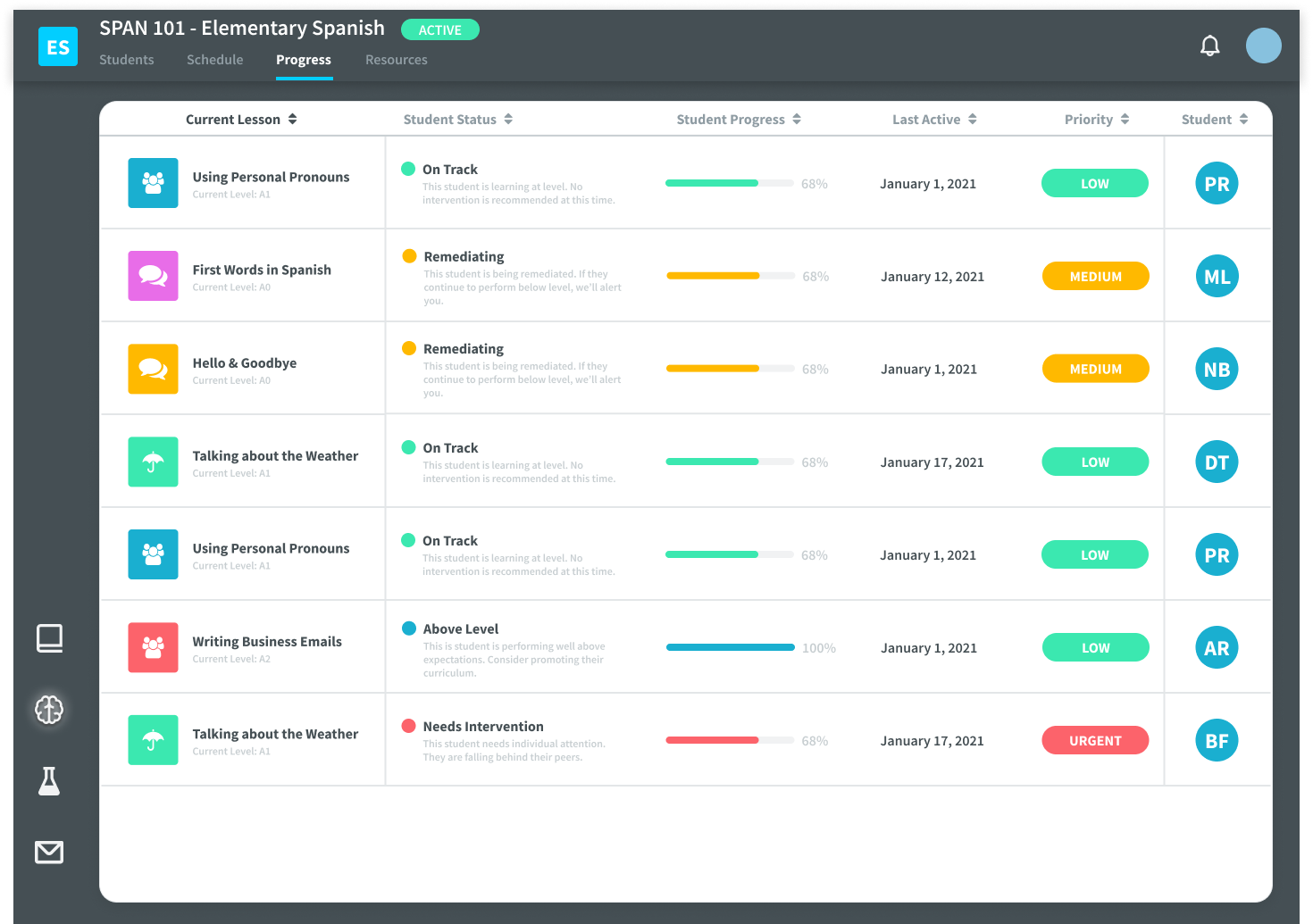
Teacher Classroom Management Dashboard
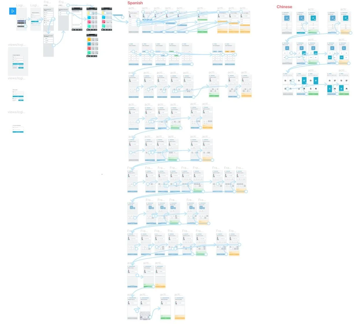
Teacher User Flow
Teacher and Student Site Map
UI Design
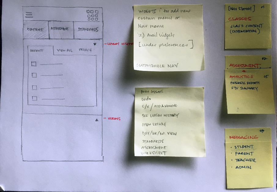
Sketching and Wireframes
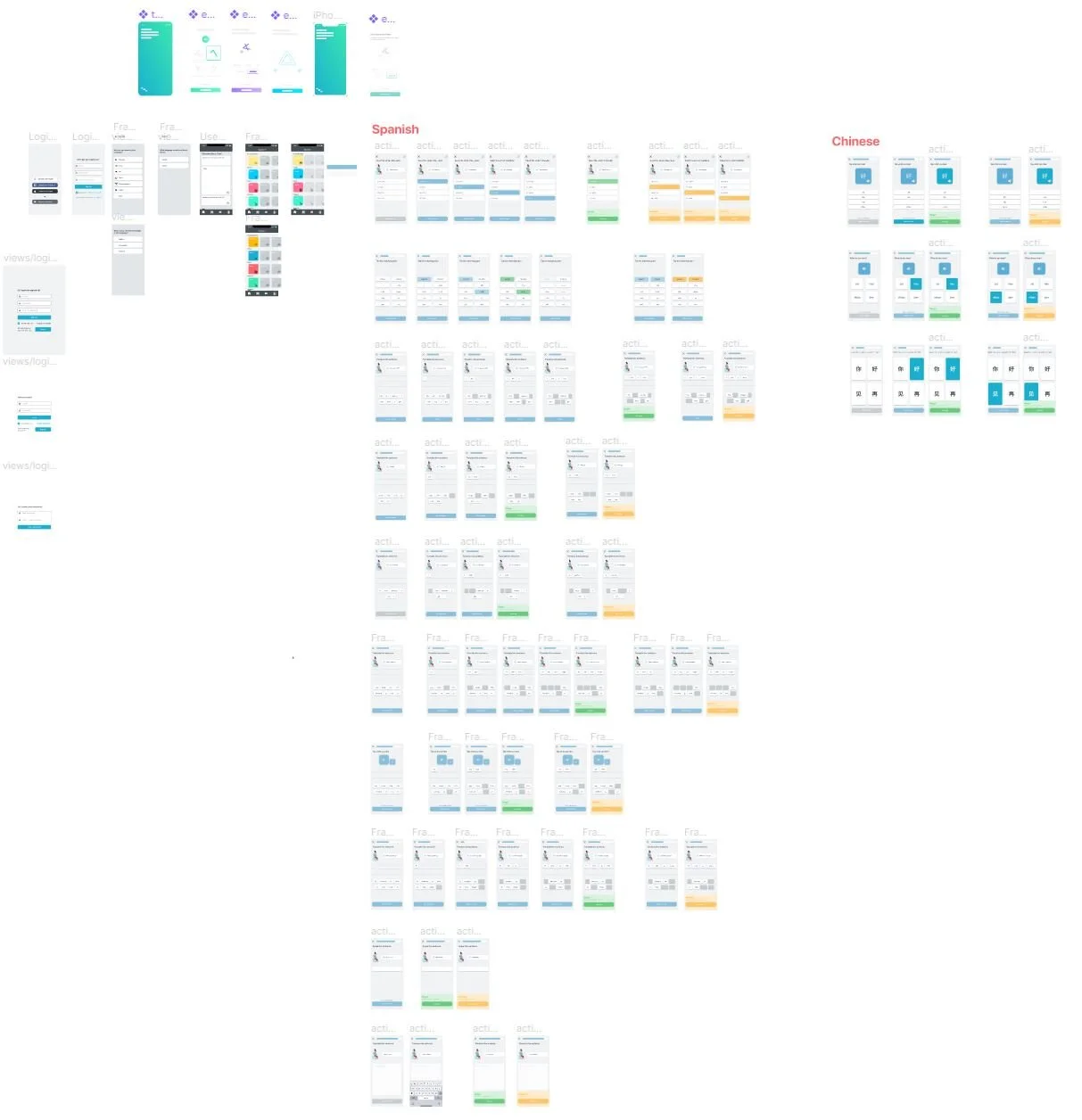
High Fidelity Screens, Design System and Prototype



Lesson one place holder
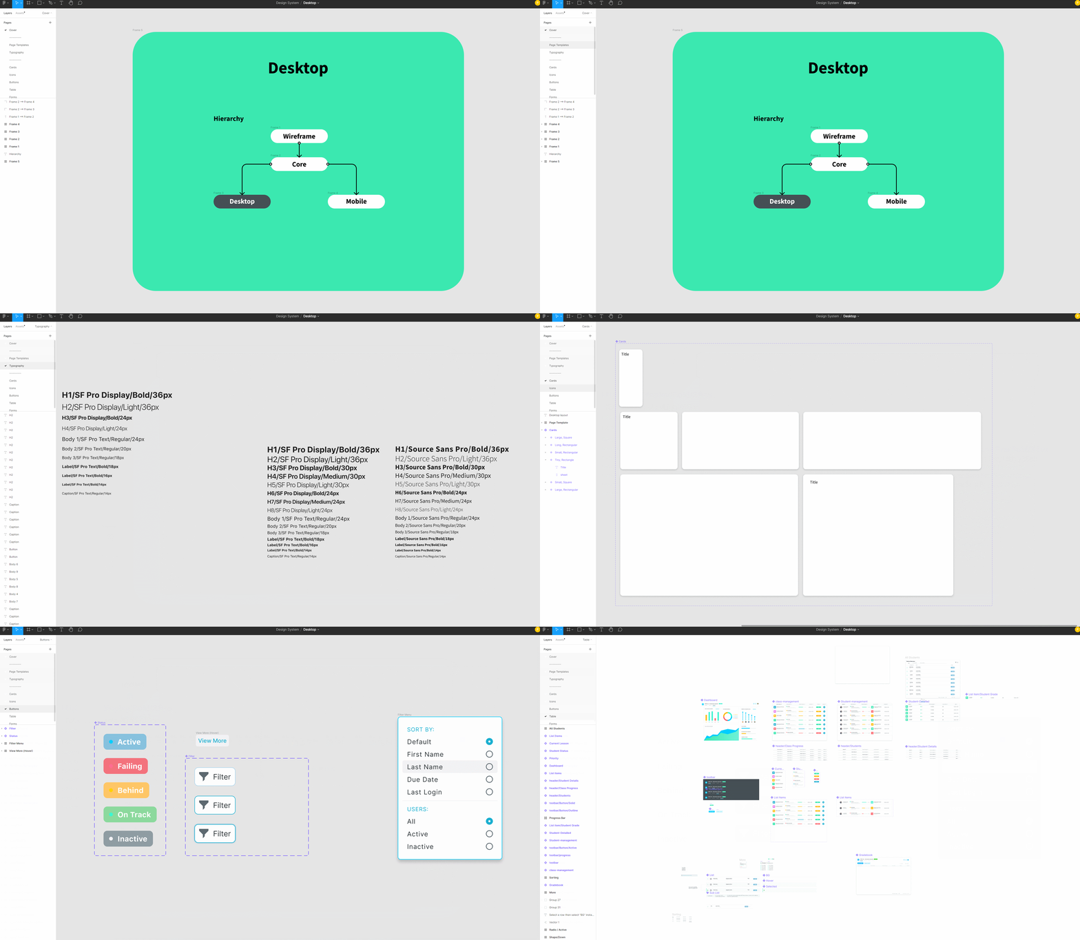
Teacher Side Design System
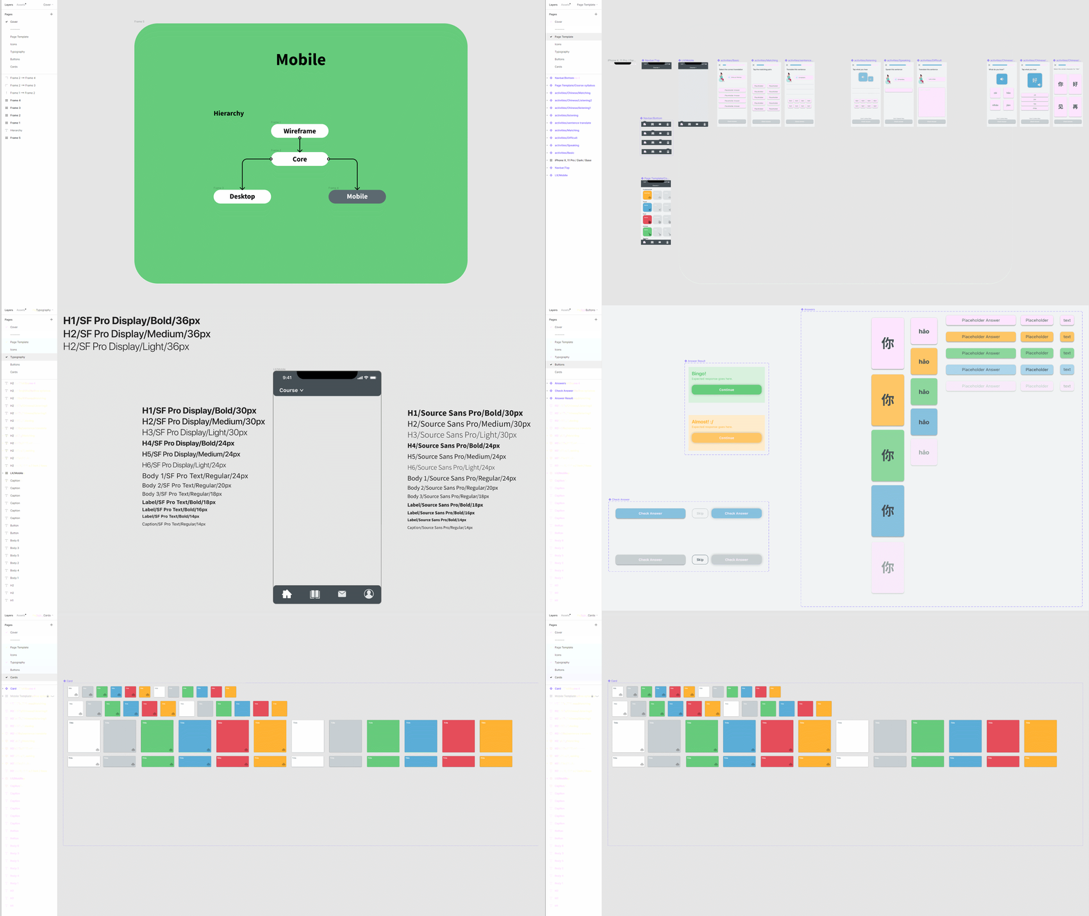
Learner Side Design System
Spanish and English placeholder prototype


