Helping young people find financial guidance.
Project Details
Design Team: Peter Rohles
Time Frame: 10 weeks. Class Project. Two days a week
Deliverable: Full UX Design Process. High Fidelity Clickable Prototype
Young people between the ages of 21 and 35 have grown up through two recessions. They don’t feel comfortable investing for retirement. They don’t feel comfortable going to a financial advisor.
Approach.
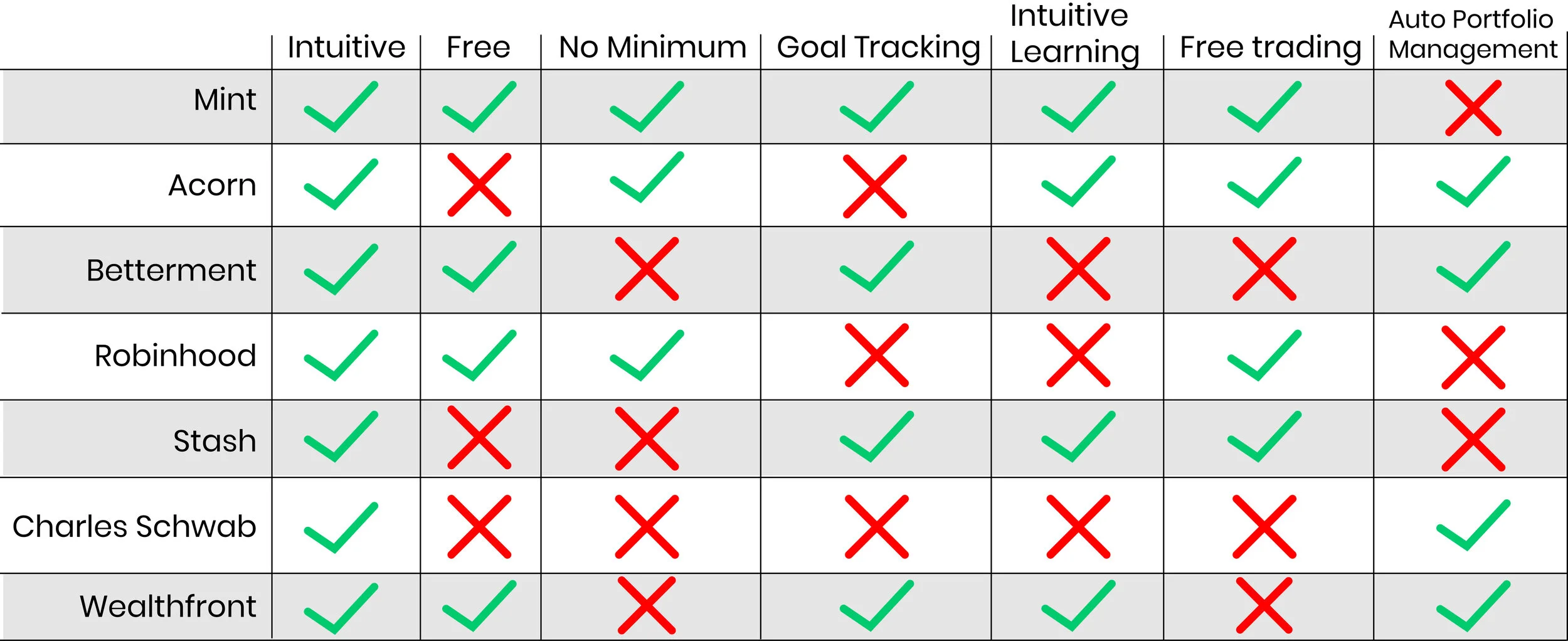
The current financial tech industry cater towards those interested in investing. But doesn’t give any guidance for those who don’t know what they’re doing. I did a comparative analysis of all the main financial tech companies currently offering investing apps. I wanted to identify their barriers for entry.
Cost
Learning tools
Automated Management options
I concluded that their are TONS of investing apps out there, and in the scope of a ten week project, i would need to try and find a unique problem to solve, or else I would get stuck designing yet another investing app.
Research.
I used a variety of different research methods to find out how millennials save and how they learned.
“I went to a financial advisor with $6,000 and was told it wasn’t enough”
Haley, 26
Affinity Map
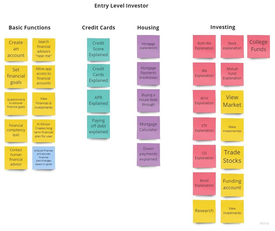
Card Sorting
User Flow
Sketches
Wireframing
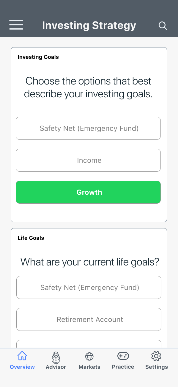
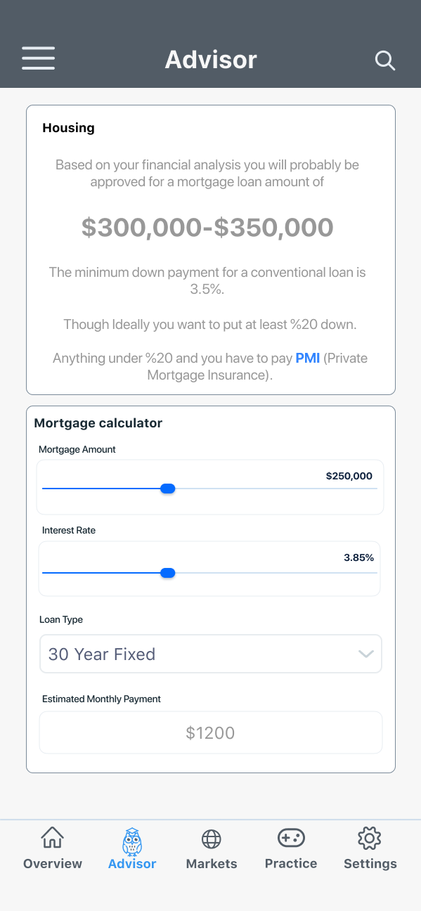
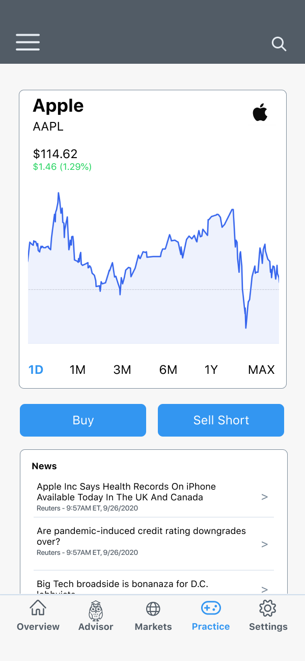
High Fidelity Prototype
Future Considerations
After finishing my first High-Fidelity prototype and testing it I found it lacked the empathy for the emotional path users take when talking about their finances and investing.
In the Future I would like to create a brand mascot to guide the users through the journey. Create a more playful UI and color scheme.
I will also be doing Tree Testing to make sure the site hierachry is in line the customer’s needs.
